Web Design
UX/UI
Salão Digital
anota ai
Enhancing the user journey of Anota AI alongside the launch of the Salão Digital, a product that expands its customer base in new directions.

About the project
Anota AI is a startup focused on delivery automation for restaurants and is expanding its operations to in-restaurant service. I was responsible for designing the page for the new feature and optimizing its experience to increase conversions.
The goal was to clearly communicate the benefits of the solution and facilitate the user's decision-making process. I collaborated with the marketing team to align strategy, content, and design. Despite the challenges, the project delivered positive results and established a new brand positioning.
Challenges
Solutions
1. Research
Benchmarking
Before redesigning the page, I conducted a benchmarking survey with Anota AI's direct competitors. The goal was to understand how our communication positioned itself in relation to the market. During the analysis, I noticed that competitors were able to explain their products better, with clearer messages focused on value for the user.

87%
These insights showed us that, to increase the engagement and conversion of our page, we needed to learn from their successes, adjusting our communication, structure, and hierarchy of information to better reflect the differentiators of Anota AI.
This stage was essential to align the new design with the real expectations of the market and users.
2. Ideation
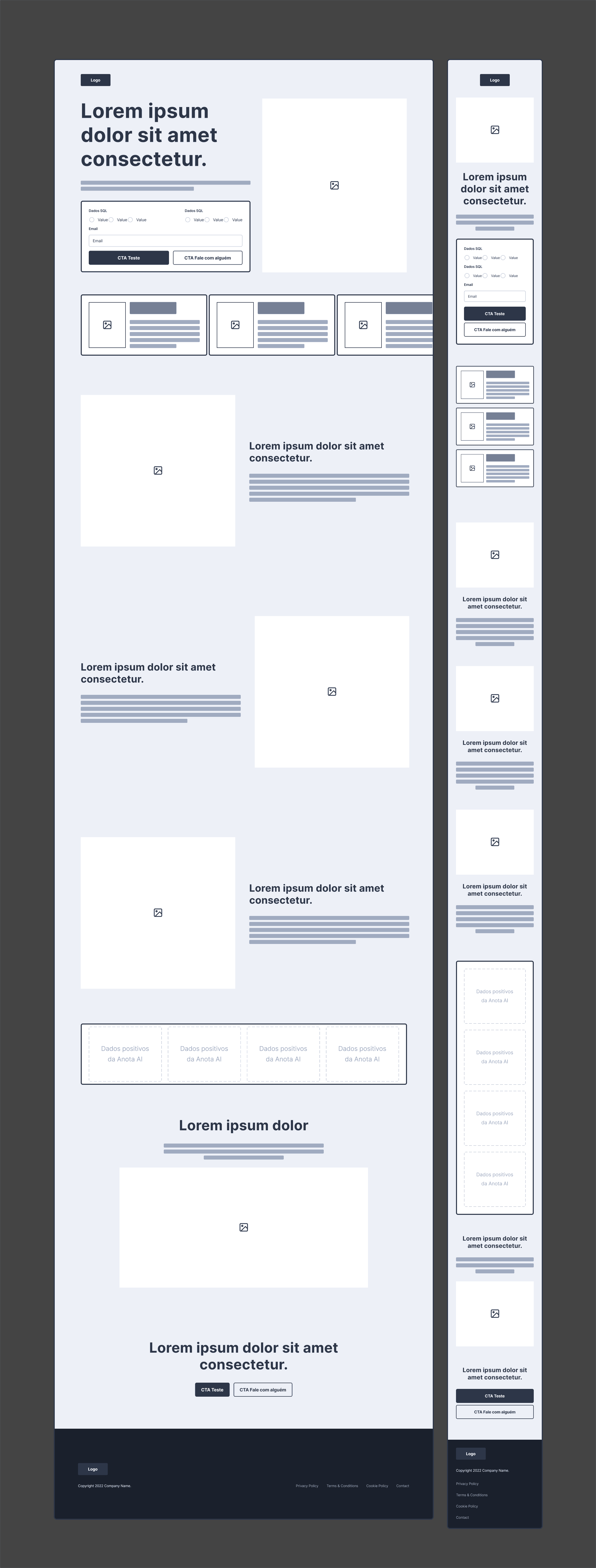
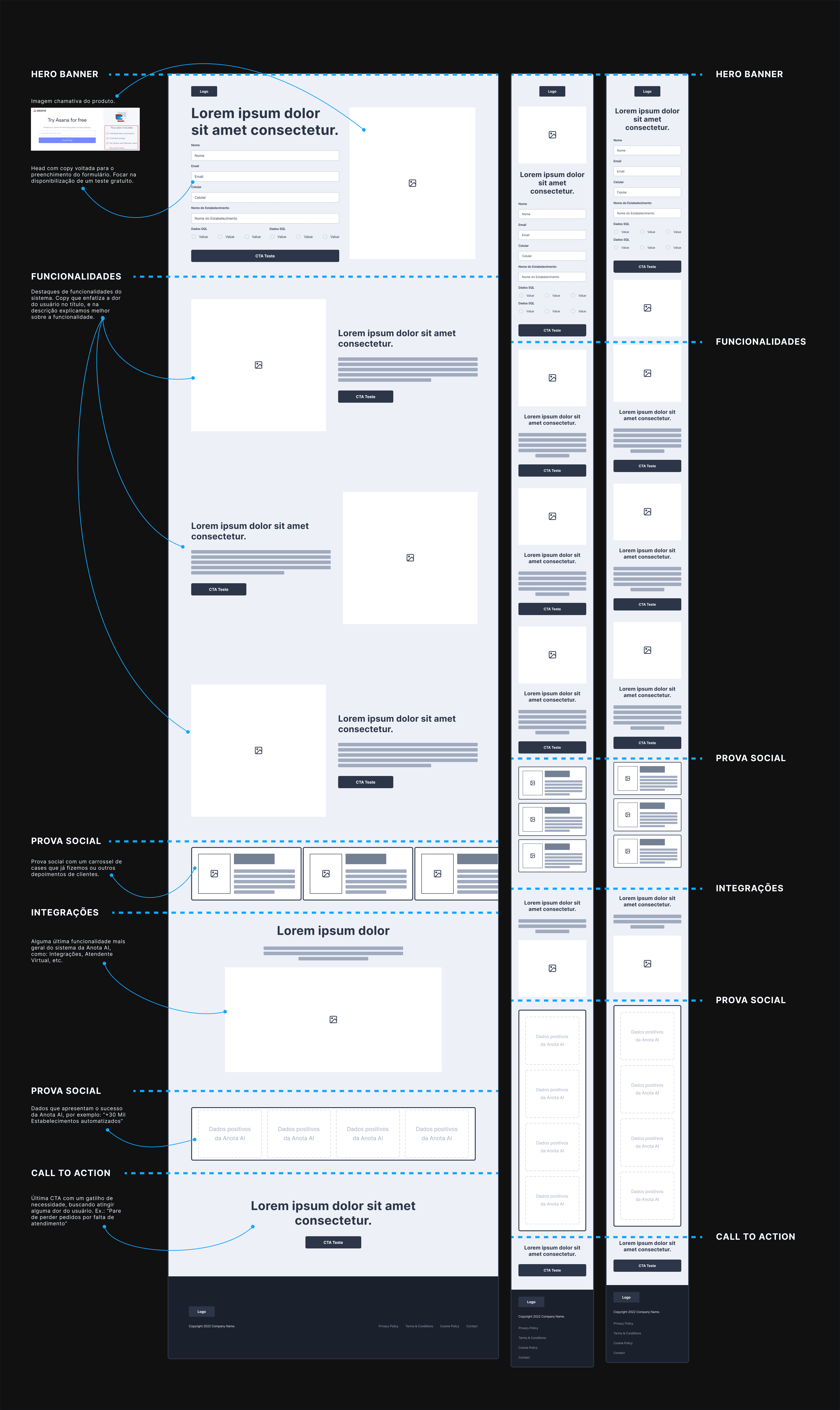
3. Design
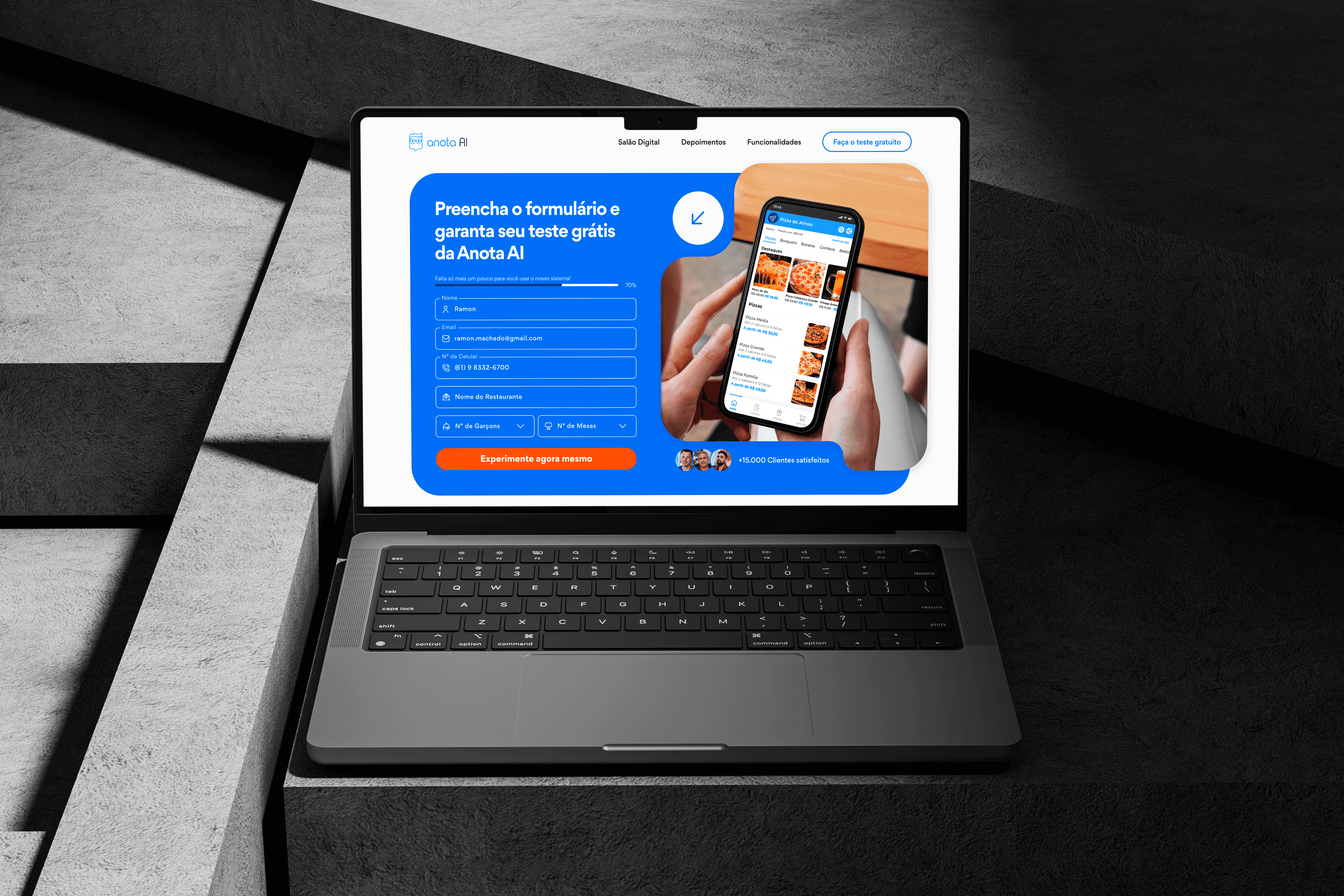
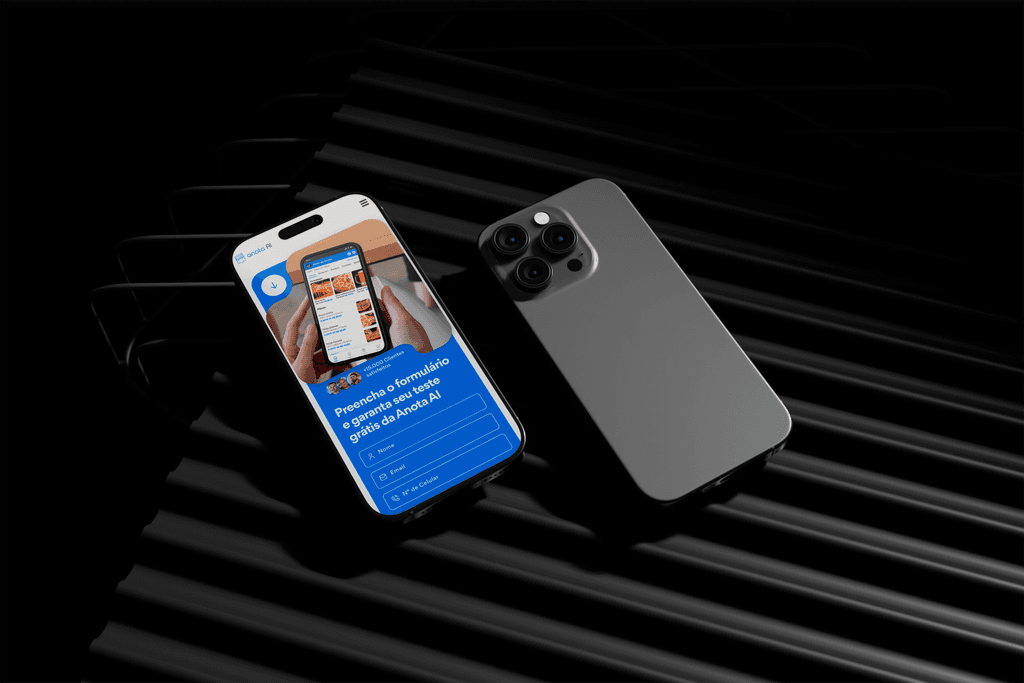
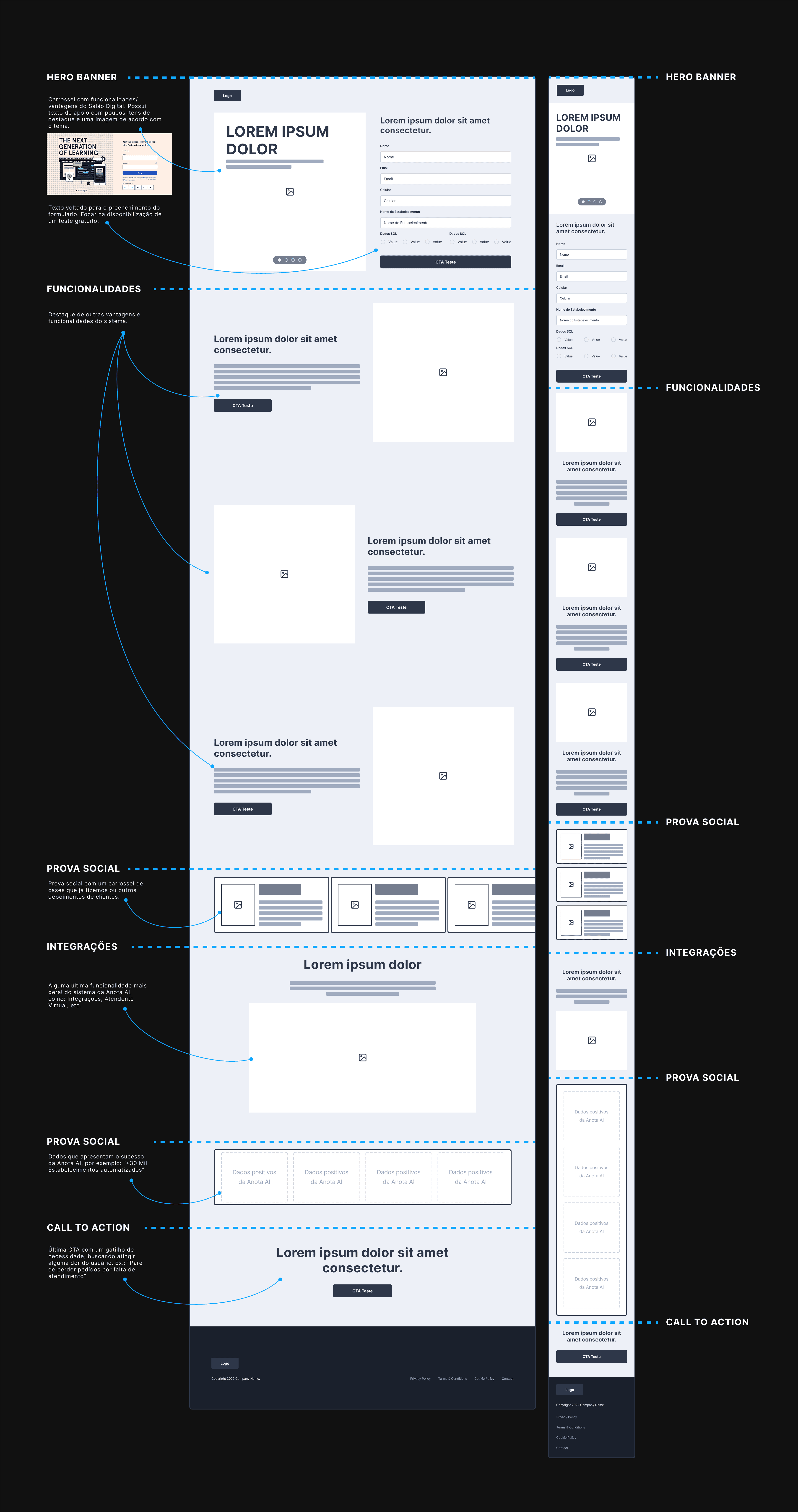
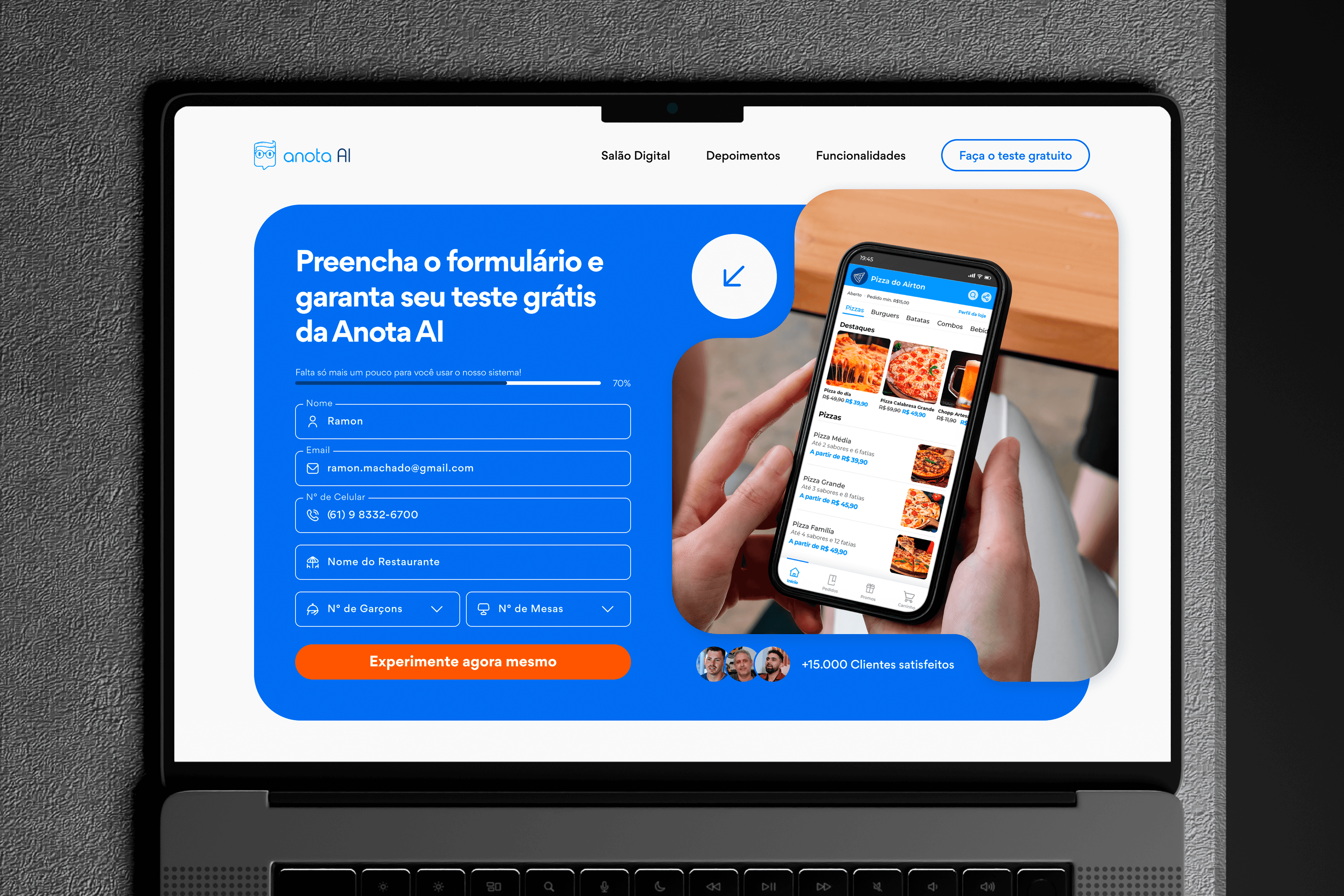
Simplified Form
The form has been redesigned with a focus on reducing friction and increasing the completion rate.
We implemented a progress bar to indicate steps and decrease the feeling of effort right at the beginning.
The form banner was designed to highlight the product during completion and include social proof that reinforces user confidence.
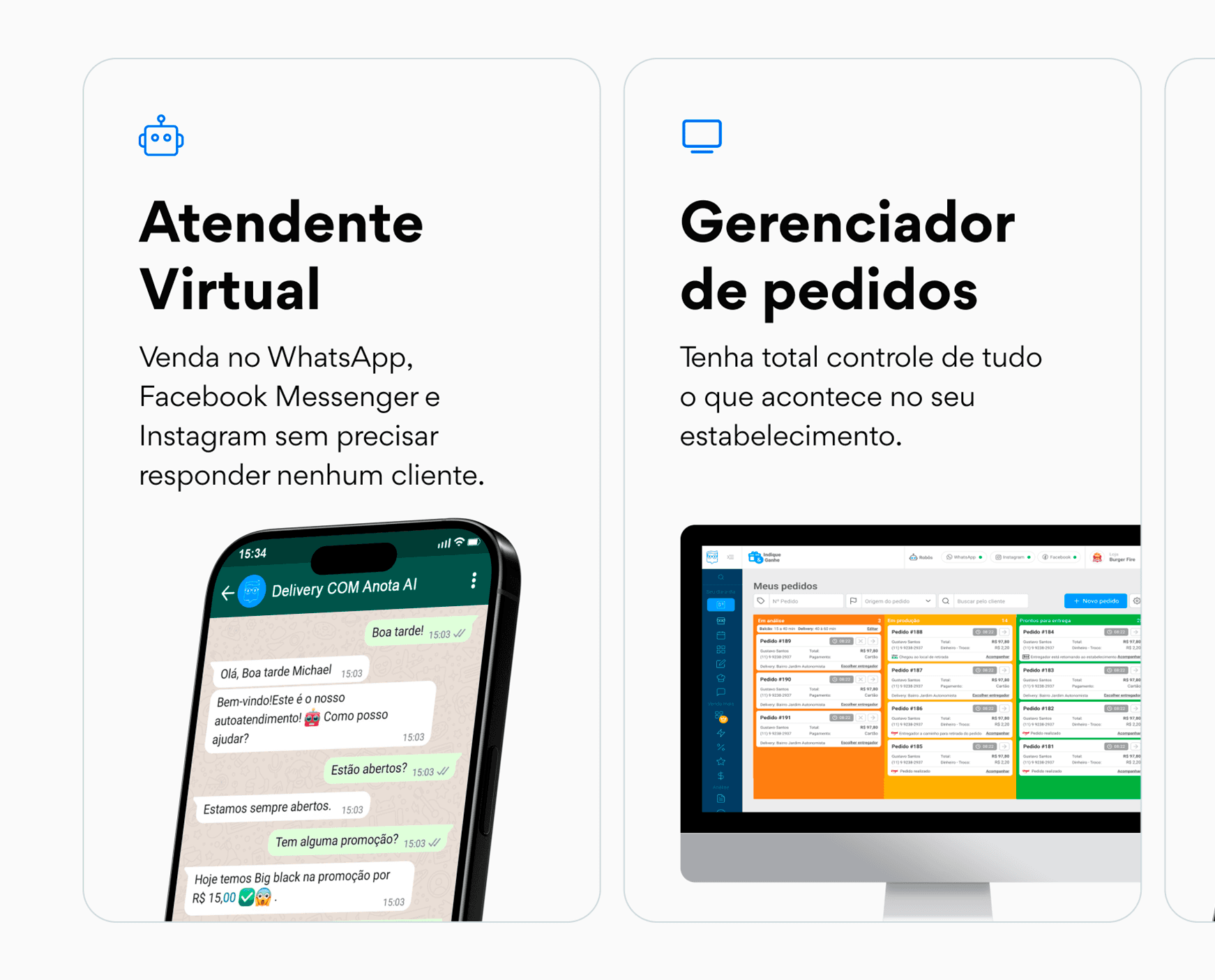
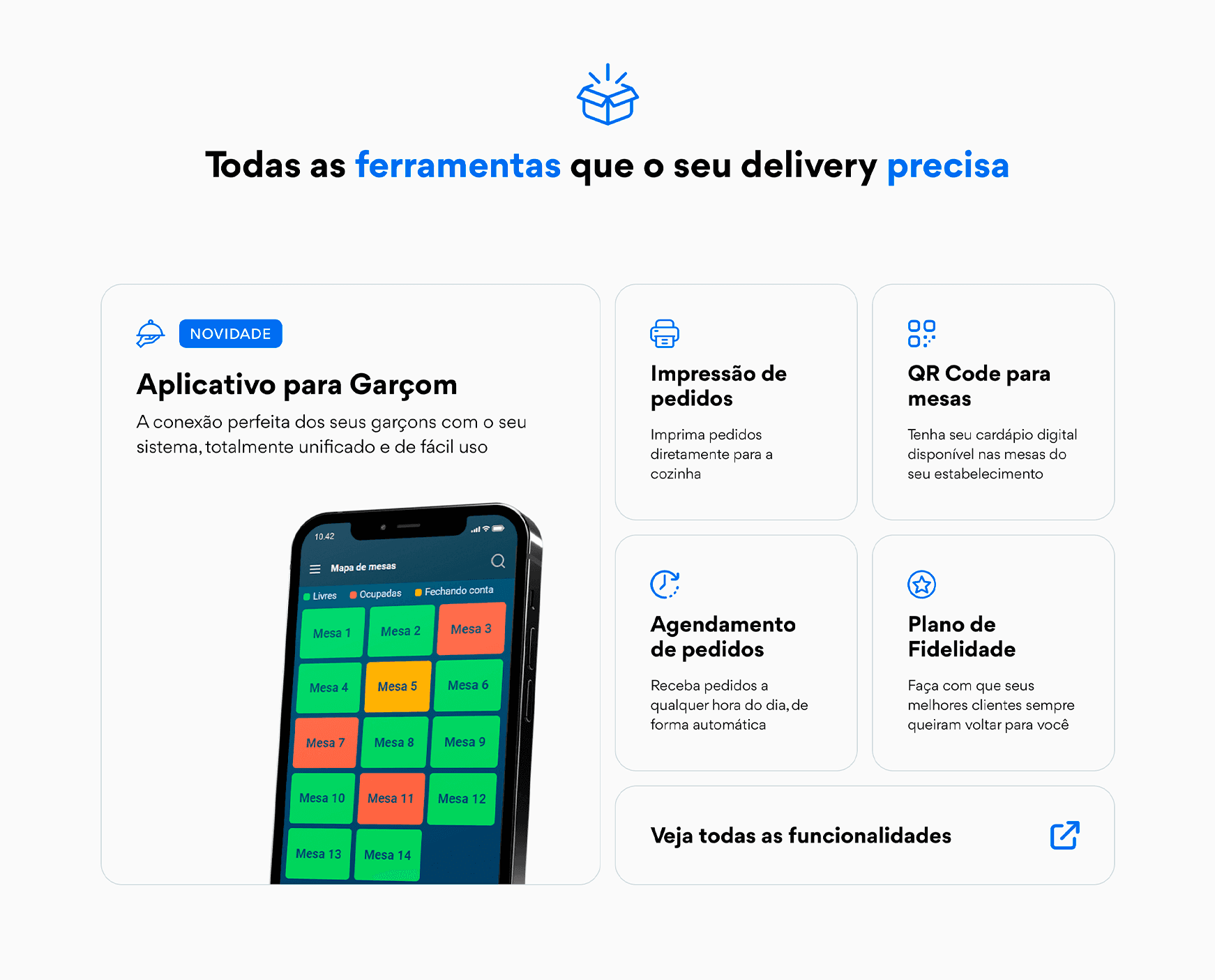
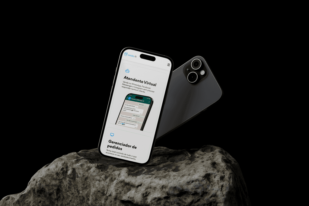
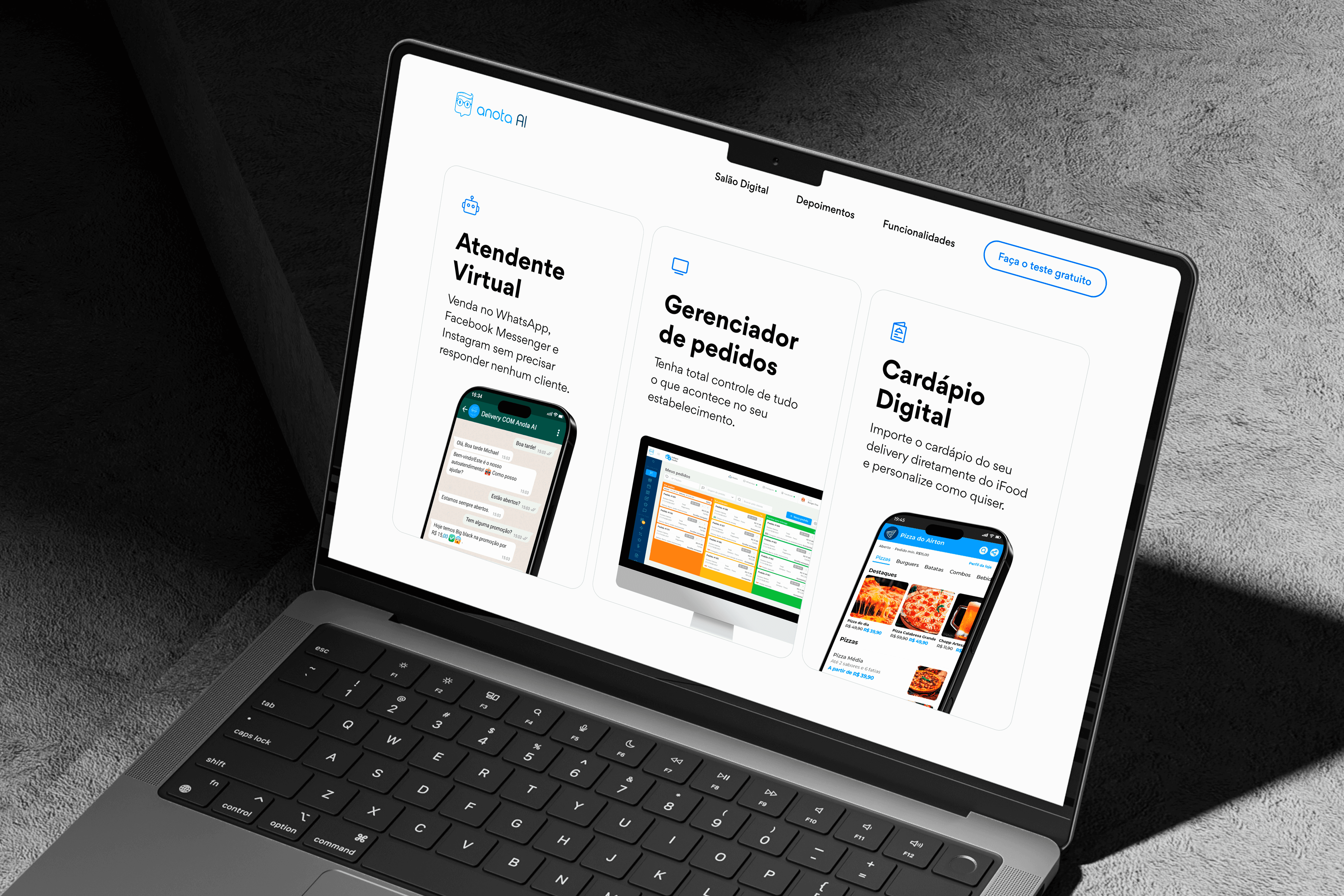
Features that make sense
We organized the features with a clear visual hierarchy, highlighting the most relevant benefits for the persona while still presenting the complete set of solutions from Anota AI.
We use standardized cards to facilitate reading and also allow scalability in the inclusion of new functionalities in the future.
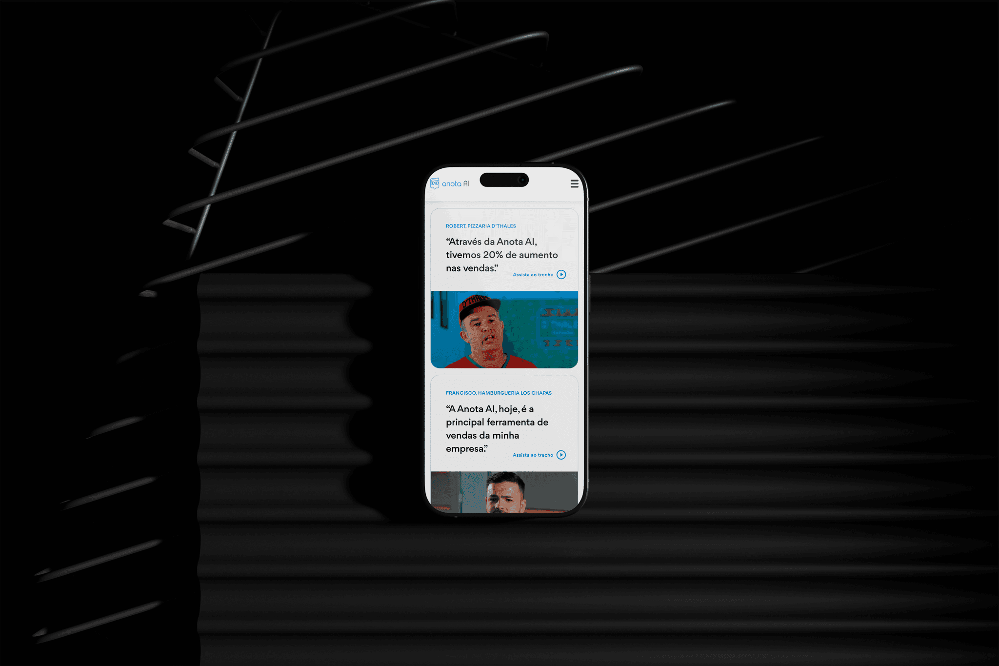
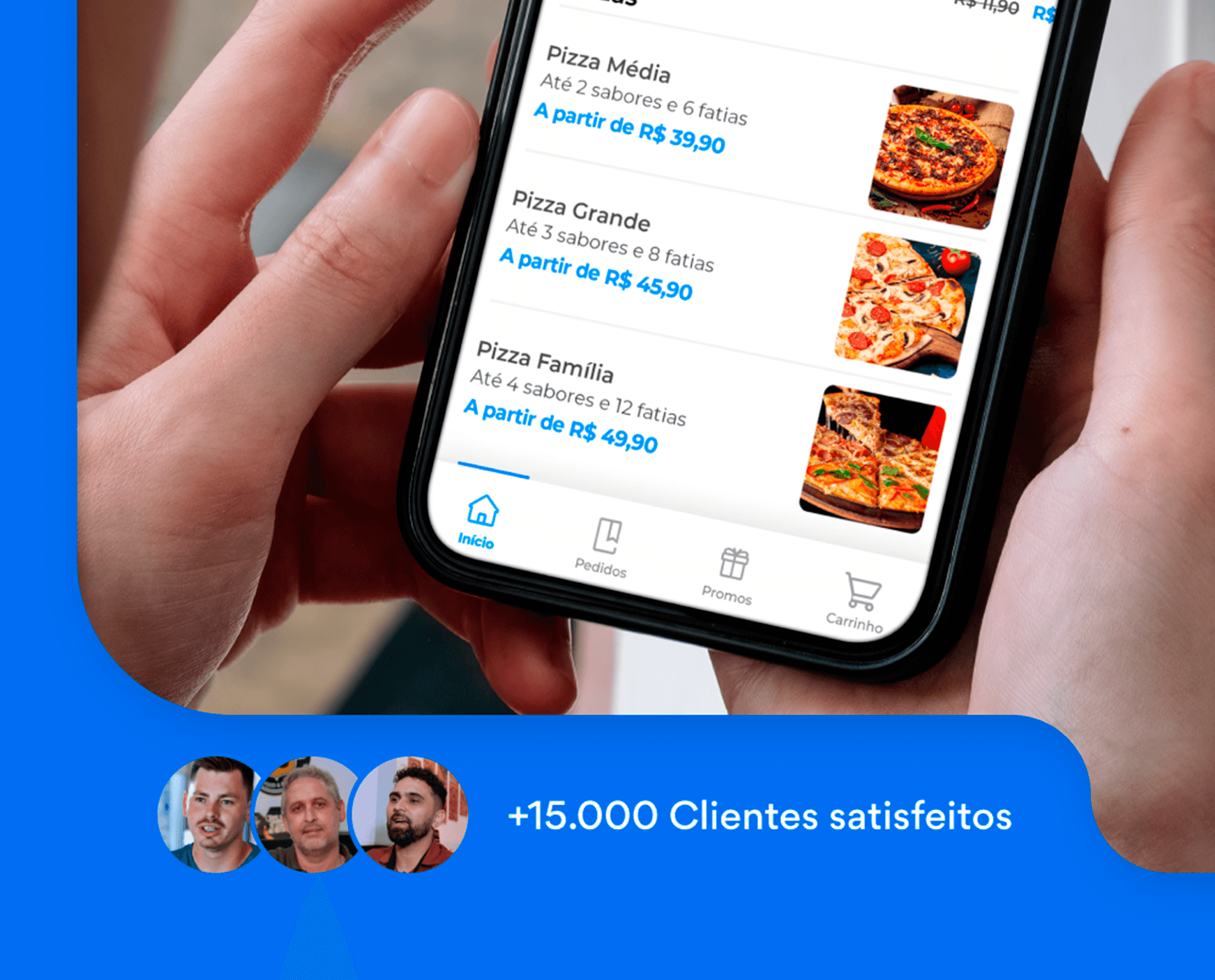
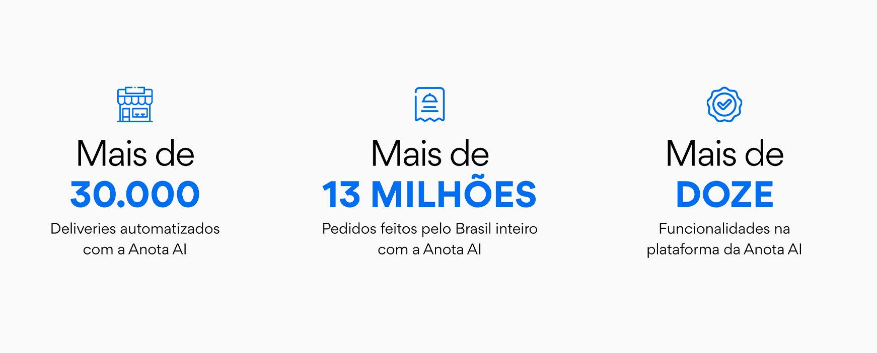
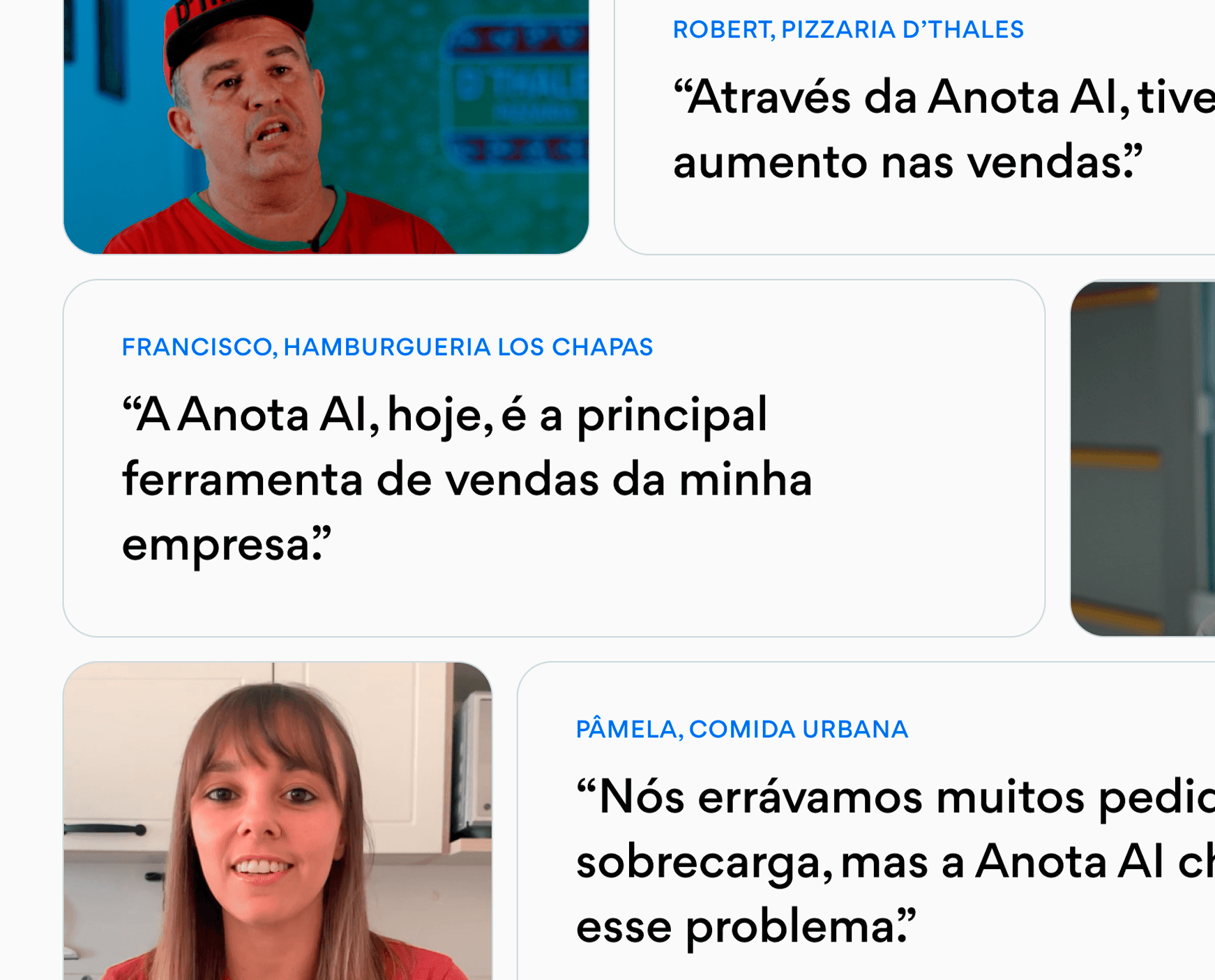
Affirming the brand
We highlight Anota AI's competitive edge: its consolidated national presence and the high level of satisfaction among its users.
These numbers were followed by real customer testimonials, taken from public sources, to bring authenticity to the communication.
By combining social proof and relevant metrics, we reinforce the brand's credibility at the moment the user is evaluating the product.
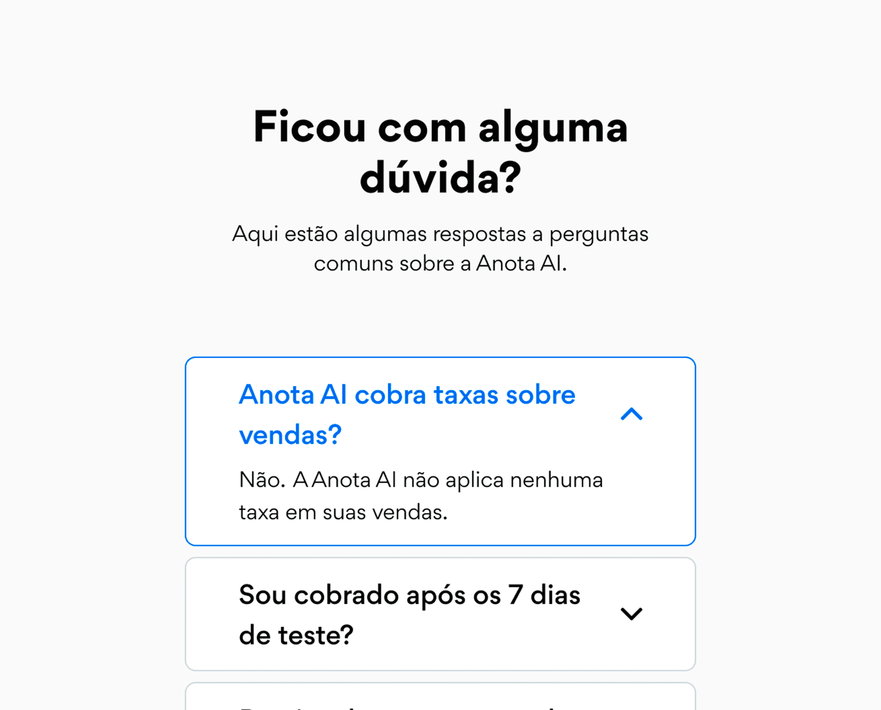
Preventing errors
To reduce friction in the sales process, we approached the sales team and identified the most common questions from customers.
Based on this, we created a strategic FAQ section aimed at clarifying these points even during navigation, facilitating lead conversion.
Results
users past the website's header
+72%
conversion rate
+30%
SQL lead generation
Thank you!
See the next case.

